The spread of cholera, intensity of hurricanes, and more: Sharing science through visualizations
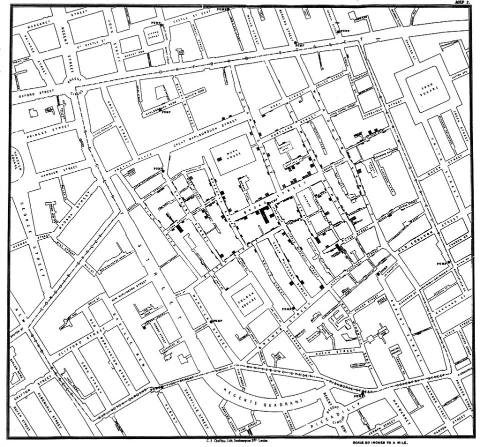
A famous historical example of a science visualization is the map of a cholera epidemic in London in 1854. This map, created by physician John Snow, helped reveal a cluster of cholera around the Broad Street pump, which was then shut off. This action almost immediately halted the spread of the epidemic.
Science visualizations have real, important impact on the world.
That is what Kate Travis, Digital Director at Science News, emphasized during a panel at the 2017 Research Teachers Conference, sponsored by Regeneron, on October 14. Kate shared “a totally biased tour of awesome visualizations,” examples she finds “really cool.”
Science visualizations have real, important impacts on the world.
These visualizations enable complex information to be shown in more parsable manners, including via maps, charts, graphics, and interactive tools. They help scientists, journalists, and others better describe confusing, complex information and data.

“My job is to present new research and scientific findings in a short amount of space in an easy to understand way,” Kate explained as she explored several science visualizations with the teachers. “I want to explain complex ideas to readers.”
The teachers in the audience murmured in excitement, reacting to the variety of visualizations and the ways they could potentially use them in the classroom. One teacher appreciated an interactive map of hurricane intensities over time. She said by looking at charts like it, her students would learn how to analyze and figure out what the chart is telling them. It will help her prepare her students for AP tests and exams.
I want to explain complex ideas to readers.
Kate noted that there are multiple reasons for scientists, journalists, and students working on research projects to visualize their data: the images can help make sense of complex information, assist people in identifying relationships and patterns, and aid in exploring and explaining data. They can reveal patterns and relationships that the data cannot always do on its own. It’s helpful for the impact of student’s work in research projects to be shown visually. For students involved in research projects, such visualizations could vastly enhance the impact of their work.
Teachers and others can view a list of science visualizations, compiled by Kate, at bit.ly/SSP-vizlinks.